Creating presentations that are accessible to a diverse audience is not just a courtesy but a necessity in today's inclusive environment. Accessible presentations ensure that individuals with varying abilities can equally enjoy and benefit from the shared content. This article highlights five key strategies for crafting PowerPoint presentations that are both engaging and accessible to everyone, including those with disabilities such as dyslexia.
Key Takeaways
- Employ accessibility checkers to identify and resolve potential accessibility issues within your presentations.
- Limit the amount of text on slides to aid comprehension and keep the audience focused on the spoken content.
- Adopt dyslexia-friendly design principles to make presentations more inclusive and easier to understand for all attendees.
1. Utilize Accessibility Checkers

Before you finalize your presentation, make use of accessibility checkers to ensure inclusivity. These tools are often built into presentation software like PowerPoint and can highlight areas that need attention. For instance, to improve your PowerPoint presentation's accessibility, navigate to the 'Review' tab and select 'Check Accessibility'. This will initiate an inspection that provides valuable feedback.
Accessibility checkers evaluate your content's compatibility with screen readers and other assistive technologies, guiding you to make necessary adjustments.
Remember, the goal is to identify and fix any potential barriers that might prevent someone from fully engaging with your presentation. Here's a quick checklist to get you started:
- Review slide reading order for clarity
- Check color contrast for visibility
- Ensure all images have descriptive alt text
- Verify that videos include captions
By addressing these points, you'll be taking a significant step towards creating a presentation that everyone can enjoy.
2. Limit Text on Slides

When crafting your presentation, keep text to a minimum. Your slides are there to support your spoken words, not to overshadow them. Aim to distill your message into concise, digestible points. This approach not only prevents the audience from being overwhelmed but also caters to those with cognitive and learning disorders who may find it challenging to read and listen simultaneously.
Reducing the number of words on your slide helps everyone. It enhances understanding and retention, making your presentation more accessible.
Here are some strategies to reduce text on your slides:
- Use bullet points to summarize key information.
- Employ slide transitions to add movement and variety.
- Highlight critical points to maintain focus.
Remember, the goal is to create slides that effectively convey information without overwhelming the audience with excessive text. Visuals can significantly enhance the audience's experience, but use them judiciously to avoid potential challenges.
3. Incorporate Dyslexia-Friendly Design

When crafting your presentation, choose a dyslexia-friendly font to enhance readability for all. Fonts like Arial, Verdana, and Tahoma are recommended for their clear, evenly spaced characters.
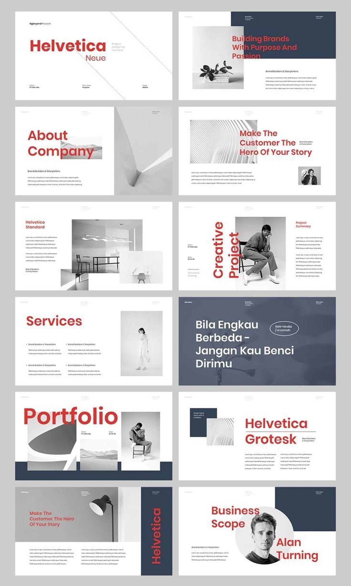
- Use a simple layout with ample white space to prevent visual overload.
- Implement clear headings and subheadings to guide the reader's attention.
- Opt for a contrasting background to improve content distinction.
By prioritizing dyslexia-friendly design, you empower everyone to engage with and comprehend your presentation, creating an inclusive environment.
Remember, these design choices not only assist individuals with dyslexia but also contribute to the overall clarity for your entire audience. A thoughtful approach to accessibility can lead to increased confidence, engagement, and comprehension for all attendees.
4. Use Graphics Effectively

Graphics can significantly enhance your presentation, but they must be used judiciously. Choose graphics that reinforce your message and aid comprehension. Avoid the temptation to include images merely for decorative purposes; each graphic should serve a clear function in conveying your content.
When selecting graphics, consider their relevance and clarity. A well-chosen image or diagram can simplify complex information and make it more memorable for your audience.
Here are some examples of effective graphic use:
- Pie charts to display survey results.
- Photographs of animals in a zoo presentation.
- Images representing different hobby categories.
- Historical landmarks and figures in a presentation about a country's history.
Remember, the goal is to create a balance between text and visuals, ensuring that your slides are not overcrowded and that the graphics do not overshadow the information you're presenting. Practice with your visuals beforehand to ensure they integrate seamlessly into your talk.
5. Engage with Presentation Tools

To truly captivate your audience, engage with advanced presentation tools. These tools can transform a static presentation into an interactive experience, fostering active participation and keeping your audience's attention. For instance, tools like Slidone, Classpoint, Mentimeter, Slido, and Prezi each offer unique features that can elevate your presentation.
Embrace the power of interactivity to make your presentations more dynamic. Use these tools to incorporate real-time polls, quizzes, and collaborative activities that invite your audience to be a part of the conversation.
Here's a quick guide to what some of these tools offer:
- Slidone: Enhances engagement with real-time feedback and interactive elements.
- Classpoint: Turns your slides into an interactive classroom with quizzes and annotations.
- Mentimeter: Allows for live polling and audience insights.
- Slido: Facilitates Q&A sessions and live voting.
- Prezi: Offers a non-linear presentation format with zoomable user interfaces.
Remember, the key to a successful presentation is not just the content, but also how you deliver it. By integrating these tools, you ensure that your message is not only heard but also interacted with, leading to a more memorable and effective presentation.
Conclusion
In summary, crafting presentations that are accessible to all is not just a matter of compliance, but of inclusivity and effective communication. By implementing the strategies discussed, such as limiting text, using graphics wisely, and considering the needs of individuals with dyslexia, presenters can create PowerPoint slides that enhance understanding for everyone. Remember to utilize tools like Microsoft's accessibility checker to identify and resolve potential issues. Ultimately, these efforts lead to more engaging and comprehensible presentations, ensuring that every member of the audience, regardless of ability, can fully participate and benefit from the shared knowledge.
Frequently Asked Questions
How can I ensure my PowerPoint presentations are accessible?
To make sure your presentations are accessible, utilize built-in accessibility checkers like the one in Microsoft PowerPoint to identify and fix issues. Ensure text is limited and slides are not overcrowded. Incorporate dyslexia-friendly design principles, use graphics effectively to convey information, and engage with presentation tools to enhance comprehension for all audience members.
What are some dyslexia-friendly design strategies for presentations?
Dyslexia-friendly design strategies include using simple, readable fonts, avoiding italics and underlining, using bullet points for clarity, and maintaining a consistent layout. Additionally, use high contrast between text and background, and provide alternative text for images to aid comprehension.
Why is it important to limit text on PowerPoint slides?
Limiting text on slides helps to keep the audience focused on the spoken content of the presentation rather than reading the slides. It benefits people with cognitive and learning disorders by reducing the cognitive load, making the information more digestible, and ensuring the slides serve as a complement to the speaker's words.
